Choosing and Preparing High-Quality Colored Tissue Paper
Evaluating Light Diffusion, Tear Resistance, and Color Vibrancy in Colored Tissue Paper
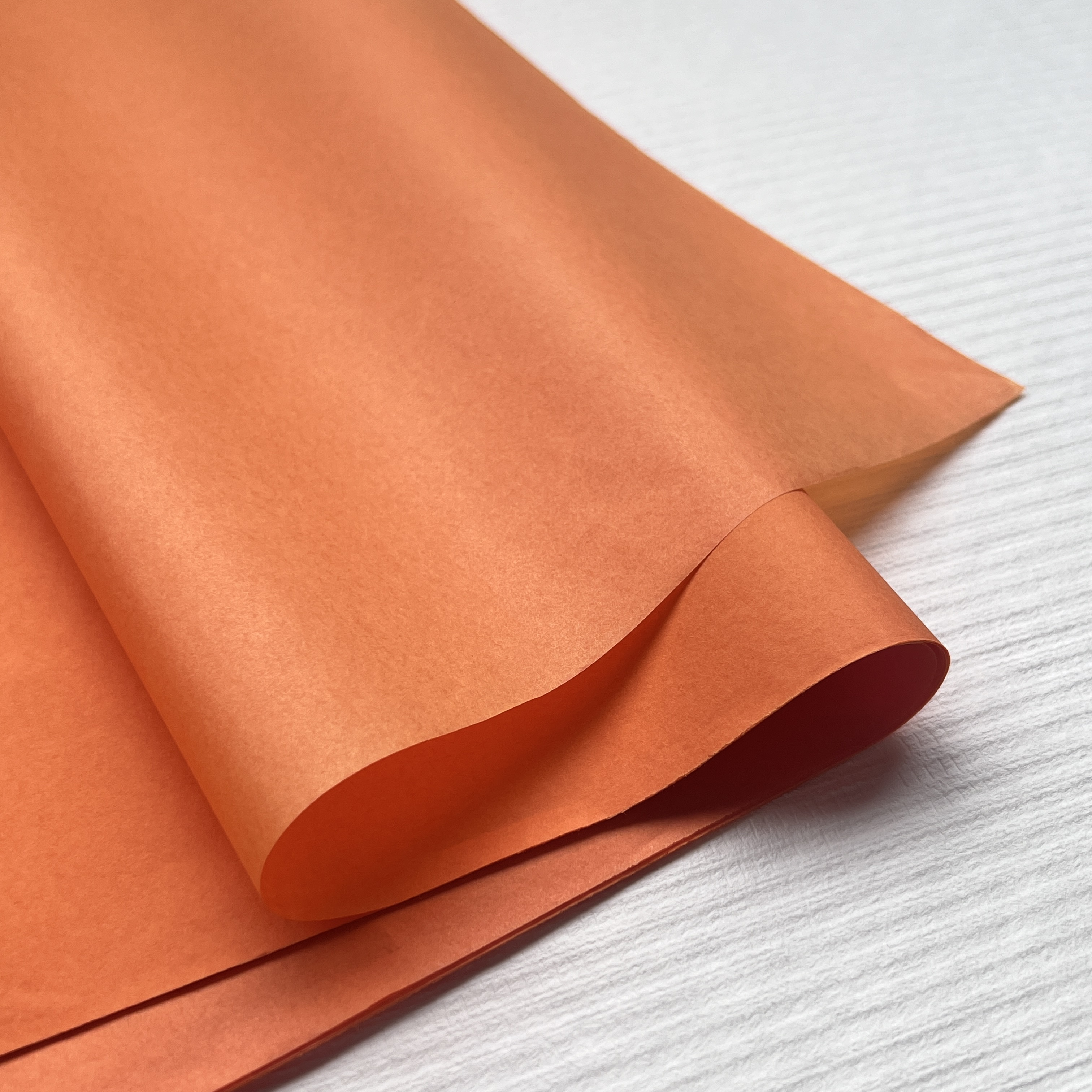
When picking out top quality colored tissue paper for lanterns, there are really three main things to look at: how light spreads through it, how tough it is against tearing, and how vibrant the colors appear. The way light moves through the paper makes all the difference for lantern glow. Good papers spread the light evenly so we don't get those annoying bright spots or shadowy areas. For strength, most folks find that anything over 30 grams per square meter holds up better when stretched and stuck down, yet still keeps that see-through quality needed for proper lighting effects. Checking color intensity matters too. Hold the paper up to strong light and see if the colors stay rich even when illuminated from behind. Cheap stuff tends to fade fast or show weird patches where the dye wasn't applied properly. Quick tip: shine a light behind a sample and give the corners a gentle tug. This shows both how well the light spreads and whether the paper will hold together during assembly. Papers that score high on all counts create lanterns that look amazing when lit and survive the whole putting together process without falling apart.
Color Theory Basics: Harmonizing Hues and Layering Colored Tissue Paper for Depth
When applied thoughtfully, colors can turn simple lanterns into something visually striking. Think about complementary colors like blue paired with orange they really pop against each other and make everything look brighter. On the flip side, similar colors such as yellow-green and lime create those nice soft transitions that give off an atmospheric vibe. Since tissue paper lets light pass through it, stacking different layers opens up all sorts of color combinations. Putting red on top of yellow makes a bright orange effect, while laying violet over teal produces a rich indigo shade. These colors change depending on how strong the light is too. For best results when layering, start with lighter colors at the bottom and build up to darker ones on top. This basic principle works wonders for creating depth and interest in any lantern design.
- Monochromatic layering: Stacking light-to-dark variants of one hue (e.g., pale pink, rose, burgundy) builds dimensional depth without chromatic dissonance
- Cut-out patterns: Removing shapes from upper layers reveals underlying colors, adding graphic definition and controlled light play
- Ombre transitions: Aligning sheets in progressive saturation or value (e.g., lemon → gold → amber) mimics natural light gradation
Always evaluate layered combinations under your intended light source before final mounting—what reads as harmonious in daylight may clash or mute when illuminated.
Building the Lantern Structure for Optimal Colored Tissue Paper Adhesion
Wire Frame vs. Folded Cardstock: Selecting a Base That Supports Colored Tissue Paper Integrity
What happens at the base determines whether tissue paper works well structurally as well as visually. Wire frames are really good for making those organic shapes, curves, or spheres where keeping tension even matters a lot. The 24 gauge floral wire strikes just the right note it holds its form pretty well but still bends so the paper can stretch gently without ripping apart. A study from last year in the Craft Materials Journal found something interesting too properly stretched wire lanterns had about 30% fewer problems with materials breaking while being built or displayed. On the flip side, when working with folded cardstock, there's instant stability for those geometric shapes, especially useful for sharp angles or modular projects. It also makes aligning things on flat surfaces much easier. Plus, those pre creased sections cut down on second guessing for people who are just starting out and generally speeds up putting everything together.
| Base Type | Structural Advantage | Tissue Paper Suitability |
|---|---|---|
| Wire Frame | Bendable contouring | Best for multi-layer adhesion |
| Folded Cardstock | Rigid geometric support | Ideal for flat surface bonding |
To make things last longer, go with cardstock that's at least 200 grams per square meter. This helps stop it from bending when multiple layers of tissue are added on top. For those spots where wires connect, either twist ties or some kind of epoxy will keep everything intact over time. When making round or freeform lanterns, wires are usually better since they handle tension evenly in all directions. But if the design has sharp edges or geometric shapes like cubes or hexagons, cardstock works much better. Before committing to full scale production, test out different adhesives and how they react with tension by doing small tests first. A quick trial run saves headaches later and makes sure what works on a small piece will work just as well when scaled up.
Applying Colored Tissue Paper: Gluing, Stretching, and Smoothing Techniques
Diluted Glue Mixtures and Brush Application Methods to Prevent Wrinkles and Bleeding
Mixing equal parts pH neutral white glue with distilled water creates the best consistency for sticking things down without wrinkles. The balance gives enough stickiness but doesn't soak through paper, which helps keep colors bright instead of letting them run or warp fibers. When applying, grab those soft bristle brushes everyone recommends. Big areas need broader strokes while smaller spots call for finer tips around edges and tricky corners. Start working from the middle outwards, gently pressing as you go to pop any air bubbles trapped underneath. Important note: always reach for non bleeding tissue paper! Regular stuff tends to release dye when wet, messing up how different layers look together. Do quick tests on small sections first just to be safe. Let each part dry for about 3 to 5 minutes before moving on. This waiting time stops everything from sliding around later and keeps all those layers lined up properly.
| Technique | Purpose | Tool Recommendation |
|---|---|---|
| Dry brush application | Minimizes moisture absorption | Foam or flat bristle |
| Directional smoothing | Eliminates wrinkles | Soft silicone spatula |
| Edge sealing | Prevents lifting | Fine-tip glue applicator |
Tension Control and Drying Sequence to Maintain Color Clarity and Surface Uniformity
Getting the right tension when working with tissue paper makes all the difference. Too loose and it will just droop and wrinkle everywhere. Way too tight? Well that's when things start tearing apart or fibers pull loose. Start by securing those paper edges with small glue dots about the size of peas. Then stretch and tweak as needed before doing the final seal. This pre-tensioning trick lets artists fix problems on the spot instead of waiting until later. When building multiple layers, follow a staged drying approach. Let the bottom layers sit flat for around twenty minutes so they stick together properly. After that, hang them upright for the next layers to avoid sticky spots forming and colors bleeding through. Need to speed things up? A hair dryer on low heat works but keep it at least a foot away from the paper surface. Never blast hot air directly onto wet areas though. Wrap everything up with one smooth layer of matte acrylic sealant spray. This helps lock in the colors, makes the paper look more see-through, and guards against moisture in the air without making it look dull or cloudy.
Enhancing Visual Impact with Patterned Layering and Strategic Lighting
Gradient, Ombre, and Cut-Out Patterns Using Multiple Sheets of Colored Tissue Paper
When working with layered patterns, there's so much more expression possible compared to just plain colors. Gradients created by layering darker shades toward the bottom mimic how light naturally fades away, giving lanterns that three-dimensional look we all love. For those ombre effects like moving from sky blue down through lavender to plum, the sheets need to overlap about a quarter to half inch around the edges. Keep glue application light at these seams so no ugly lines show through. Adding cut outs creates interesting empty spaces too. Try tracing shapes like stars, hexagons, or plant designs on the top layers to let light shine through from below. This technique really makes the shape stand out while keeping everything structurally sound. Don't go crazy though - aim for no more than 30% of the surface covered with holes to maintain strength and proper light distribution. And remember to check how things look in actual use environments. Something that looks great in our studio might end up looking cluttered or washed out when installed somewhere else.
Sealing, Diffusing, and Testing Light Output to Maximize Colored Tissue Paper Luminosity
Getting the right amount of light out of these lanterns really comes down to three main things: how we seal everything up, where we put those little LED bulbs, and then just plain old testing them out. For sealing, most folks find that running another coat of diluted glue works best. Mix about one part adhesive with three parts water and spread it gently using a soft bristled brush. What this does is hold all those fibers together better while cutting down on unwanted glare and actually making the material look a bit more see-through without messing with the colors. When placing LEDs inside the lantern space, try to get them centered as much as possible. These modern bulbs don't give off much heat at all, so they won't damage the paper over time or create those annoying spots where the color fades away faster than elsewhere. Start testing with a 5 watt warm white LED since it tends to throw light around pretty evenly without creating hotspots. Do this in a room that's not too bright and check how strong the glow looks, how soft the edges appear, and whether the colors stay true when viewed from different sides. Tweak things like number of layers, how much they overlap each other, or even how dense those cut outs are based on what we actually see happening, not just what some formula says should happen. After going through this back and forth process guided by actual light behavior, the final product will emit exactly the kind of gentle, purposeful illumination we're after.