 EN
EN

Why Premium Colored Tissue Paper Is a High-Impact Brand Differentiator
Crafting memorable luxury unboxing through tactile color and sensory storytelling
Premium colored tissue paper transforms ordinary gift openings into immersive sensory journeys. The crinkle of high-GSM paper—felt before the gift is even revealed—triggers emotional resonance through texture, weight, and sound. This tactile first impression sets the tone: velvety softness signals care; substantial drape implies quality; rich, intentional color cues brand identity. Deep burgundies evoke heritage and opulence; soft blush pinks suggest warmth and approachable luxury. When these hues align with the gift box, interior lining, and even digital touchpoints, they reinforce narrative continuity—turning packaging into a cohesive, multi-sensory extension of the brand story. Consumer studies show this integrated sensory experience lifts perceived value by 27% over standard packaging.
Driving organic social engagement: How premium colored tissue paper fuels 4.2x more unboxing shares
The visual impact of premium colored tissue paper creates naturally shareable moments—especially on Instagram and TikTok, where unboxing content thrives. According to McKinsey’s 2023 Luxury Packaging Report, products wrapped in custom-colored tissue generate 4.2x more organic social shares than those using generic white or pastel alternatives. Two factors drive this uplift: first, vibrant, saturated tissue provides high-contrast backdrops that make products pop in photos and videos; second, consistent chromatic branding builds recognition—68% of consumers associate signature tissue colors with specific luxury brands after just three exposures. For example, a fine jewelry brand using teal tissue paper saw 31% higher Instagram Story engagement when the hue echoed the undertones of its aquamarine gemstones. In this way, premium tissue becomes a silent, scalable ambassador—one that extends reach and credibility long after the unboxing ends.
Strategic Color Customization for Cohesive Luxury Brand Identity
Pantone-matching and chromatic consistency across packaging touchpoints
True brand cohesion begins with precision: premium colored tissue paper must match your core palette down to the undertone—not just approximate it. Pantone Matching System (PMS) specifications ensure identical color reproduction across tissue, boxes, ribbons, tags, and even digital assets. Without this fidelity, minor deviations fracture perception—subtly undermining trust in craftsmanship and attention to detail. Luxury brands treat chromatic alignment as non-negotiable: a single mismatch between tissue and box can dilute the sense of intentionality that defines premium experiences. Specify PMS codes directly to suppliers—and request physical strike-offs—to guarantee your tissue reflects the exact depth, saturation, and warmth embedded in your brand’s visual language.
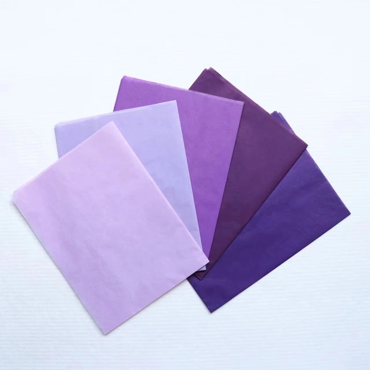
Psychological impact of color in premium colored tissue paper: Conveying exclusivity, warmth, or sophistication
Color is never neutral—it’s a strategic signal. In premium tissue paper, hue functions as shorthand for brand values and audience aspiration. Deep jewel tones (emerald, sapphire, amethyst) convey rarity and enduring prestige; muted earth tones (terracotta, oat, heather) project grounded authenticity and warmth; metallic accents (rose gold, antique silver) imply meticulous finishing and time-honored artistry. Crisp white communicates modern minimalism and purity; charcoal suggests innovation and authority; burgundy signals legacy and substance. The right choice aligns psychology with positioning: a heritage jeweler might select royal blue to echo centuries-old royal commissions, while a sustainable luxury skincare brand could opt for sage green to reinforce botanical integrity and calm assurance. Done intentionally, color transforms tissue from filler to focal point—a quiet but powerful layer of brand storytelling.
Material Excellence: Key Specifications That Define True Premium Colored Tissue Paper
GSM, acid-free certification, and archival-grade durability — non-negotiables for luxury gifting
Material integrity separates premium tissue from commodity alternatives. Grammage (GSM) of 30g/m² or higher delivers essential performance: enough body to hold shape during handling, yet sufficient drape for elegant presentation. Below this threshold, tissue tears easily, pills under friction, or loses color vibrancy—compromising both aesthetics and function. Acid-free certification is equally critical: it eliminates lignin and sulfur compounds that cause yellowing, brittleness, and deterioration over time—non-negotiable for heirloom gifting or collector-grade products. Archival-grade durability goes further, ensuring colorfastness, fiber stability, and resistance to environmental stressors like humidity and UV exposure. Together, these specs form the foundation of museum-caliber packaging—where preservation meets presentation.
Eco-luxury alignment: FSC-certified pulp and water-based dyes in premium colored tissue paper
Today’s luxury consumer expects ethics to be woven into excellence—not added as an afterthought. FSC-certified pulp guarantees fibers originate from responsibly managed forests, with full chain-of-custody traceability and zero deforestation risk. Water-based dyes replace petroleum-derived solvents with plant-based or mineral pigments—achieving rich, lightfast color without toxic runoff or compromised biodegradability. This combination delivers uncompromised luxury and verifiable sustainability: 72% of high-net-worth shoppers cite eco-conscious packaging as a decisive factor in brand loyalty, per 2024 luxury retail surveys. Crucially, these standards don’t sacrifice sensory appeal—FSC pulp retains softness and strength; water-based dyes yield deeper, more nuanced hues. The result is packaging that embodies brand values authentically: luxurious because it’s responsible, not in spite of it.