Why Texture Elevates Gift Bag Presentation with Colored Tissue Paper
The Dual Impact of Tactile and Visual Texture on Unboxing Experience
The textures we can feel and see turn opening a gift bag into something special that engages multiple senses at once. When someone reaches for crinkly tissue paper in bright colors, they want to touch it right away. The colors catch our eyes too, building excitement before we even get to what's inside. These combined sensations actually stretch out the whole unboxing experience. Even small gifts suddenly seem bigger when packaged thoughtfully with techniques like crumpled paper or folded sections that create volume. A study published last year showed that people experience about a third more dopamine activity when receiving gifts wrapped in textured materials. This proves just how much our brains respond positively to packaging that stimulates both sight and touch simultaneously.
How Perceived Value Increases When Colored Tissue Paper Adds Dimension and Softness
The size and texture of something say a lot about its quality without needing words at all. According to research from Packaging Insights in 2022, presents wrapped in multiple layers of colored tissue got called "luxurious" 47% more often than ones just laid flat on cardboard. When it comes to tissue thickness, anything over 20 grams per square meter works best, particularly if made with cotton or virgin wood pulp mixtures. These thicker sheets give that soft cushioning effect that really holds things in place, which somehow makes people think more thought went into picking out the gift. Take peach colored tissue around gold jewelry as an example. The warm peach against cool metal creates this fancy look that feels almost museum worthy. Studies tracking where eyes go when looking at gifts show these color combinations can boost perceived value by nearly 30% in our heads without us even realizing it.
| Texture Technique | Perceived Value Increase | Sensory Impact |
|---|---|---|
| Crumpled Layers | +34% | Auditory crinkle, visual depth |
| Smooth Draping | +22% | Tactile softness, visual fluidity |
| Color Contrast | +41% | Emotional resonance, visual hierarchy |
Proven Techniques to Maximize Texture Using Colored Tissue Paper
Crumpling, Fan-Folding, and Twist-and-Tuck Methods for Volume and Crinkle Retention
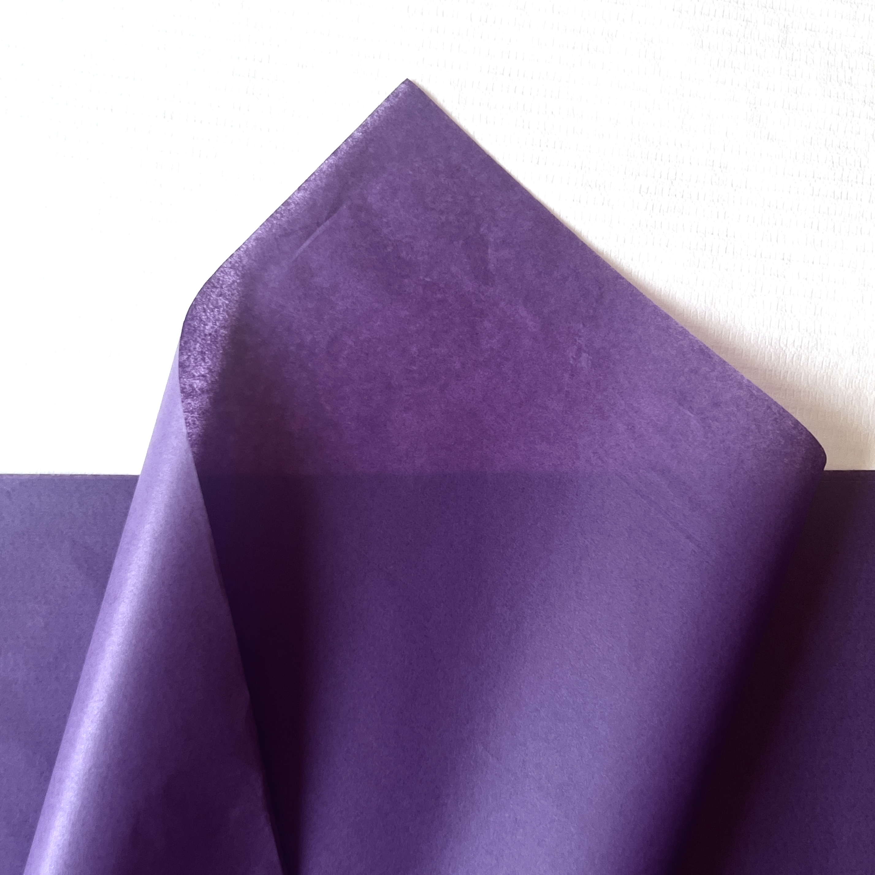
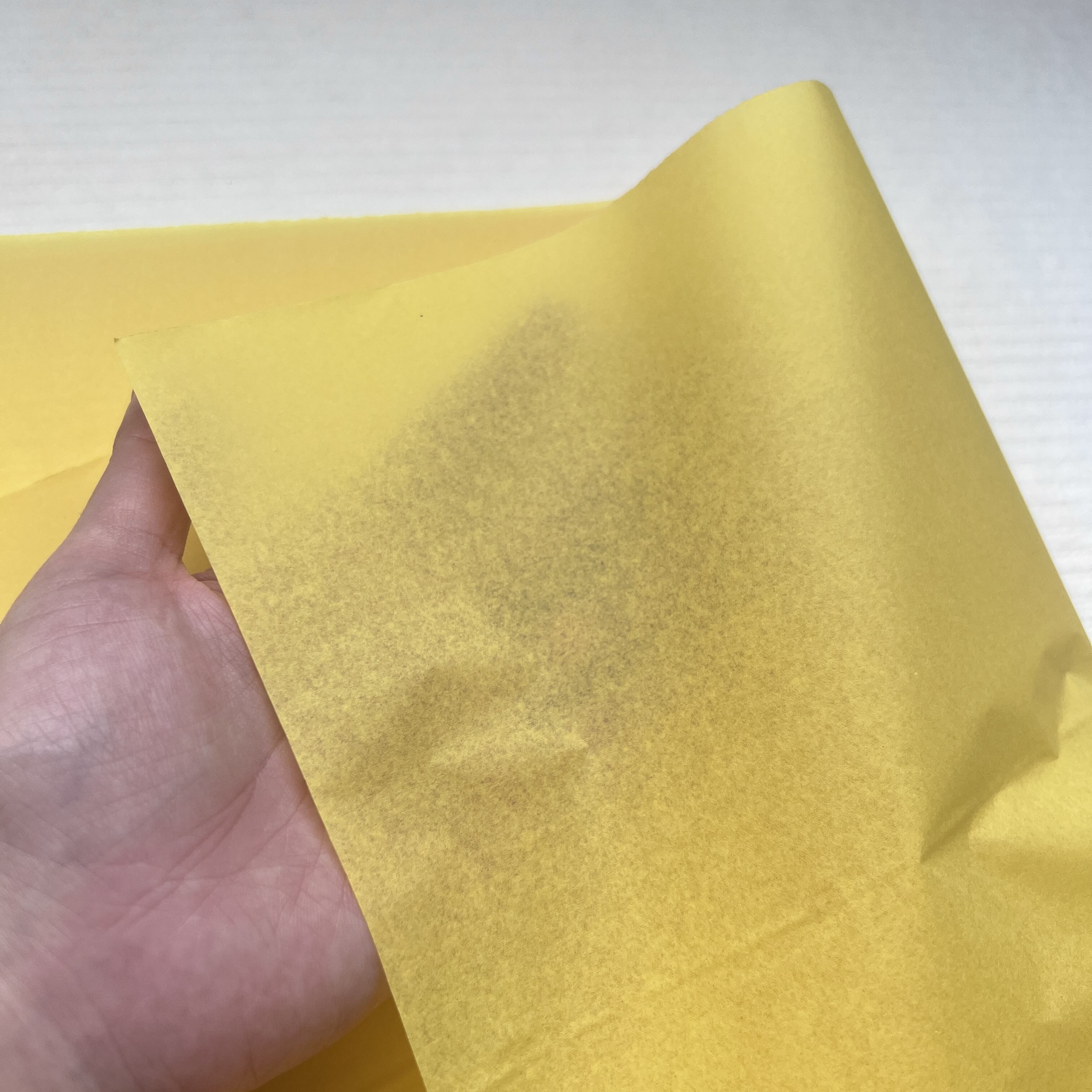
When it comes to creating interesting textures, crumpling, fan folding, and twist-and-tuck techniques each produce something different, but they all need good structure to maintain their shape and keep that nice crinkly feel. To get started, just scrunch up sheets into loose ball shapes for immediate volume and depth. If wanting something more precise, try vertical accordion folds with a pinch right in the middle to make those pretty radiating pleats that stay put without flattening out. The twist-and-tuck method involves gathering tissue at an angle, twisting one end into a spiral, then tucking it underneath whatever is being wrapped so the texture stays locked in place while still letting those soft little peaks pop up naturally. These approaches really do make gifts look more valuable somehow, maybe because our fingers want to explore those dimensional surfaces and we take longer opening them. Heavier weight tissue works best here, anything around 20gsm or thicker. Lighter paper just falls apart when manipulated and loses both the sound and feel that makes these techniques special.
Strategic Layering: Controlling Density and Color Contrast for Depth
When we talk about layering techniques, what we're really doing is turning those plain old flat bags into something people can actually feel and experience. Start by creating a stable foundation using around two to three crumpled layers at the bottom. Then add some smooth or gently draped fabric on top that lets in light and creates interesting reflections. Think carefully about color combinations too. Darker shades work great underneath lighter ones because they create shadows that give depth. Try pairing colors that go together well, such as teal alongside coral, but vary their transparency levels so one doesn't completely overpower the other. Bright colors tend to stand out best when placed against neutral backgrounds, whereas going for similar colors in different intensities (like various shades of pink) gives off an expensive, sophisticated vibe perfect for premium products. According to some research published in packaging journals, gifts wrapped this way are seen as about 30-35% higher quality compared to just wrapping them in a single sheet of paper.
Selecting the Right Colored Tissue Paper for Optimal Texture and Performance
Weight, Fiber Blend, and Finish: Key Material Properties That Shape Drape and Crinkle
Three material properties determine how well colored tissue paper performs in real-world gifting scenarios:
- Weight (gsm) governs drape and resilience. Lightweight tissue (15–18 gsm) flows softly around fragile items like jewelry—minimizing imprint risk—while heavier grades (25–30 gsm) hold structured folds and resist crushing during transport or handling.
- Fiber blend affects recovery and sustainability. Virgin wood pulp retains crinkle better after manipulation; recycled fibers offer eco-credibility but may compress over time—opt for hybrid blends when balancing ethics and performance.
- Surface finish influences both function and feel. Smooth finishes glide easily into bags and create sleek, modern lines; lightly textured or embossed finishes add subtle friction that helps arrangements stay in place.
Always verify colorfastness via rub tests before bulk use—bleeding dyes undermine premium perception instantly. Match specifications to purpose: delicate items demand fluidity (15–18 gsm), while scarves or candles benefit from supportive structure (25–30 gsm).
Designing Thematic Impact Through Color and Texture with Colored Tissue Paper
When colors meet textures, they actually change how we see them. Matte surfaces make colors look richer and deeper, whereas something with a little shine makes those same colors pop more. Wrinkled materials bounce light around in ways that create depth, while smooth fabrics let colors stay pure and intense. Think about fall designs: dark burgundy fabric that's been crumpled up feels warm and earthy, like sitting by a fire on a chilly evening. On the flip side, when smooth teal is combined with gold folds that fan out, it brings to mind calm ocean waves at sunset – there's something very peaceful about it. According to research from the Packaging Impact Journal last year, these kinds of thoughtful color and texture pairings can really connect with people emotionally, increasing their response rate by almost half.
| Theme | Color Palette | Texture Technique | Psychological Effect |
|---|---|---|---|
| Luxury | Gold + Charcoal | Smooth layering | Sophistication, exclusivity |
| Earthy | Terracotta + Sage | Heavy crumpling | Warmth, organic comfort |
| Festive | Crimson + Silver | Twisted peaks | Energy, celebration |
Leverage color psychology deliberately: cool blues with airy ruffling suggest calm; dense crimson folds convey passion and presence. When texture and tone align with intent, gift bags become immersive, memorable experiences—not just containers, but curated moments.