
 EN

What Role Does Tissue Color Paper Play in Layered Packaging Design?
In layered packaging, tissue color paper is the quiet layer that helps the product, the box, and the opening moment feel connected. It is tempting to treat tissue as a decorative extra, but the choice also affects the packing workflow: the sheet can frame a product, separate it from the outer pack, and make a simple pack-out sequence easier to repeat.
From a packaging-paper technical advisor’s perspective, the useful question is not simply “Which shade fits the palette?” It is how the paper will be placed, handled, folded, and seen alongside the product. When that sequence is clear, tissue color paper can support a deliberate layered design without being asked to do work that belongs to cushioning, barriers, or the shipping carton.
What layered packaging design asks each layer to do
A layered pack normally combines several jobs. The outer layer carries structure and protects the shipment. A box, bag, or sleeve provides the presentation frame. Tissue color paper usually sits closer to the item: it can line a box, wrap a product, divide components, or soften the first visual reveal. The product itself remains the focal point.
That boundary matters: tissue is not a substitute for tested protective packaging. If an item needs impact protection, moisture resistance, or food-contact assurance, those requirements should be defined separately. Tissue color paper is most useful when the priority is presentation, light surface separation, and a coherent handoff from the outer package to the item.
Color creates hierarchy, not just decoration
An effective color layer gives the eye a route through the pack. A neutral box with one colored tissue layer can direct attention toward the item. A matching tissue tone can make a printed label or ribbon feel more intentional. A contrasting sheet can create a clearer reveal, provided the contrast does not compete with the product.
Start with three visible elements: the outer packaging color, the product’s dominant color, and the mark or label the customer should notice first. Then choose whether the tissue should blend in, support the palette, or make a controlled contrast. This is especially useful with colored tissue paper because a sheet occupies a broad area even when it is lightweight; a small color change can shift the perceived balance of the entire box.
Color alone is not enough. Dark or highly saturated paper should be sample-tested around light-colored products and finishes before a production decision. The relevant question is not only whether the shade photographs well, but how it behaves in the intended pack-out workflow.
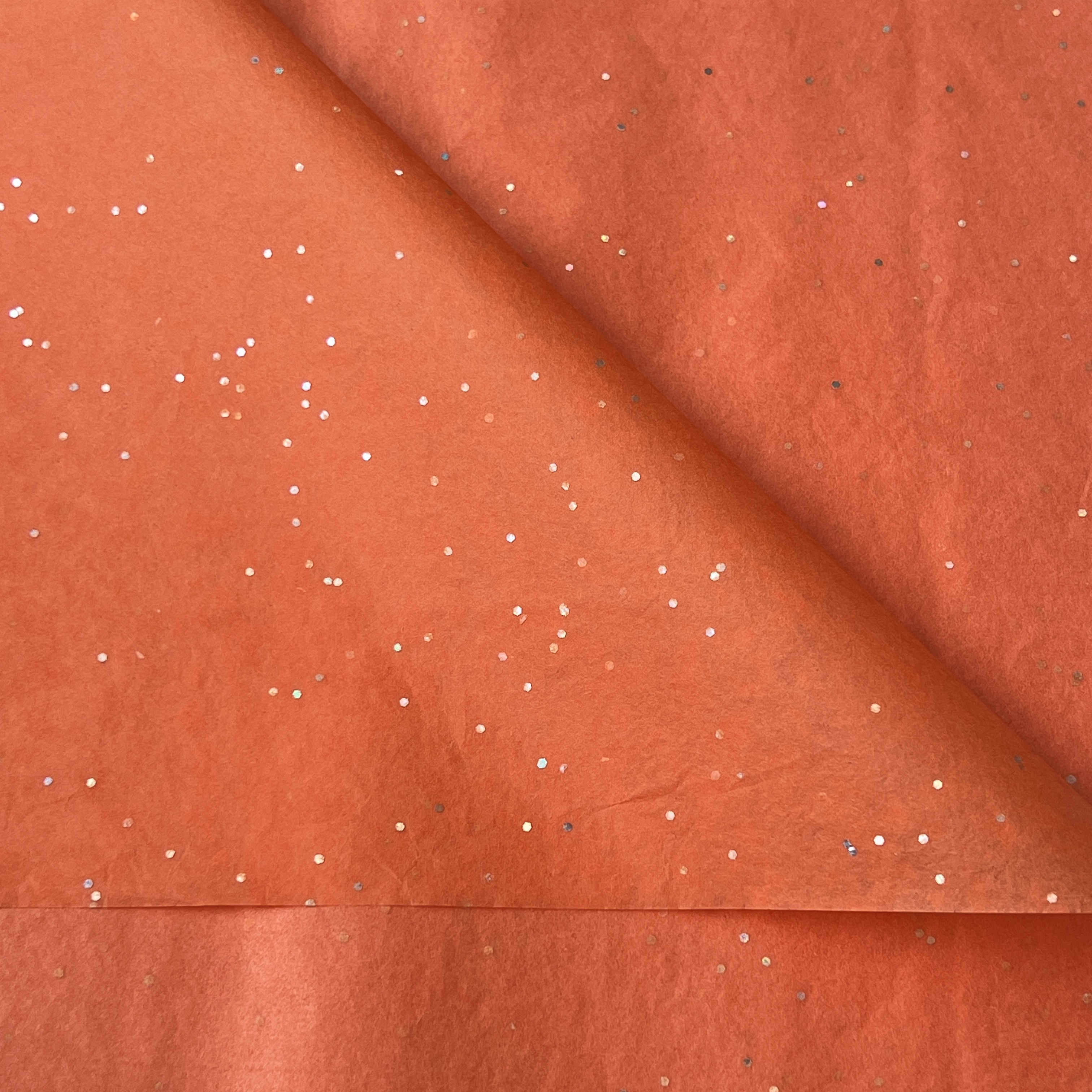 A coordinated tissue layer can frame the product and connect the inner pack to the outer palette.
Tissue color paper gives the product a visual boundary
One practical role of tissue color paper is to make the product feel placed rather than dropped into a container. A bottom sheet can create a clean stage inside the box. A partial wrap can separate a folded garment, accessory, or gift item from adjacent components. A top sheet can hide the contents just enough to create an opening sequence.
For multi-item packs, that visual boundary is particularly useful. Instead of relying on several unrelated inserts, the packing team can use one consistent tissue treatment to group items and guide the customer’s attention. If the paper is mainly used for presentation rather than protection, this approach is more relevant. Products with delicate surfaces or unusual shapes still need a pack-out trial to confirm the fold pattern and separation method.
Format determines whether the design works at the packing table
A beautiful tissue choice can fail operationally if its format does not fit the actual routine. Sheets may suit a measured box size and a repeatable fold. Rolls may be practical where the team cuts paper to changing lengths. The choice depends on the product dimensions, the number of folds, and how consistently the pack is assembled.
Rather than choosing a shade first, clarify whether the paper is for lining, wrapping, or dividing. That small change in order often prevents a color choice from becoming a handling problem. A tabletop sample is useful, but the next question is whether it works during the intended pack-out sequence: can the team position it without unnecessary adjustment, and does the finished fold keep the product visible in the right way?
Use texture and layering to add depth carefully
A layered pack does not need many materials; a restrained stack often feels more considered. Tissue color paper can work with a rigid box, a simple sticker, a paper band, or a small information card because it introduces softness between harder or flatter components. Slight crumpling may create a relaxed, handmade feeling; crisp folds can support a cleaner retail look.
Keep the hierarchy clear. If the outer box has a strong print, a quieter tissue color may prevent visual noise. If the box is plain, colored tissue paper can carry more of the palette. When a logo pattern, ribbon, and tissue all use different colors, the opening can feel busy rather than premium. A sample pack with the real product is the most reliable way to judge the combined effect.
Plan the tissue layer as part of a repeatable system
For B2B packaging teams, tissue color paper serves more than a single unboxing moment. It can help establish a repeatable visual system across seasonal packs, retail orders, and gift presentation. The material should be specified as part of the pack-out instructions, not left as an afterthought for individual packers to interpret.
- Define the role: lining, partial wrap, divider, top reveal, or light void presentation.
- Map the palette: identify the outer pack, product, label, and tissue colors together.
- Confirm the format: record sheet dimensions or roll-cut practice for the intended box or bag.
- Run a pack-out trial: check fold consistency, surface contact, visibility, and the opening sequence.
- Document what needs verification: material specifications, color transfer risk, and any application-specific requirements should be confirmed with current samples and documentation.
A simple decision framework for colored tissue paper
| Packaging question | How tissue color paper can help | What to confirm |
|---|---|---|
| Should the product feel more premium on opening? | Use a controlled reveal or lining layer to frame the product. | Fold pattern, product visibility, and pack-out consistency. |
| Does the brand need a stronger color system? | Use colored tissue paper to connect the inner pack to the outer palette. | Color relationship with the box, label, and product. |
| Are several items packed together? | Use tissue as a visual divider or grouping layer. | Whether extra protective components are still needed. |
| Is the team packing at scale? | Choose a sheet or roll format that supports the real workflow. | Dimensions, handling steps, and sample approval. |
Final perspective
Tissue color paper earns its place in layered packaging when it has a defined job. It can connect color, create a softer transition into the pack, give products a visual boundary, and support a repeatable opening experience. One attribute rarely settles the choice; tissue color paper usually needs a short set of priorities covering appearance, handling, format, and verification.
Begin with the intended pack-out sequence, then test the chosen colored tissue paper with the actual product and outer packaging. That approach keeps the design grounded: the tissue layer supports the presentation while the rest of the packaging system handles the protection and requirements it is designed to meet.